I will be trying out different fonts for the magazine title. I will aim to try and use different fonts however if this not look right when testing i will stick to one consistent font.
 The font i will try out first is 'Times New Roman'. I have chosen this font as Vogue magazine uses a similar font and i like the effect of it.
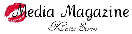
This font i will use to go under to main title as it has been abbreviated. I think this font works well as it contrasts the first font. The first font is very bold and stands out, where as this font is relaxed and looks informal. I think that it shows that the magazine targets different audiences as well. By having a fun font and a more sensible font.
 The font i will try out first is 'Times New Roman'. I have chosen this font as Vogue magazine uses a similar font and i like the effect of it.
This font i will use to go under to main title as it has been abbreviated. I think this font works well as it contrasts the first font.
 The first font is very bold and stands out, where as this font is relaxed and looks informal. I think that it shows that the magazine targets different audiences as well. By having a fun font and a more sensible font.
No comments:
Post a Comment